
01 The brand on one page
The brand is Thomas Pohle. The legal entity is Pohle Advisory GmbH, Hedingen, Switzerland. Thomas Pohle sells momentum. B2B companies call when their marketing doesn’t get going. He gets it moving, together with their team.
What he does
B2B marketing that runs: positioning, outbound and ABM, PR, content, AEO and SEO, websites, CRM and automation, marketing leadership. AI-native: every process starts with the question whether AI can do it faster, or do it for us.
Who he talks to
Founders and CEOs of B2B companies, often in DACH, sometimes their head of marketing. Nobody owns marketing, nobody knows where to start, or sales is short on pipeline.
Proof
More than ten years in B2B marketing, in-house at Link11, Beekeeper and smino, most recently as Head of Marketing. Marketing for eight markets. CEO and co-founder of TEISENDA.
How it feels
Fast, bold, smart. Never a guru, never stiff, never slick.
Three commitments this guide enforces
- One red, everywhere the same. Cardinal
#CC1E38for the mark, the accent word, the button and the light trail. One red moment per screen. - Dark is the stage. Ember Black
#0D0A0Ais the default ground. Ash is for print and long documents. - One typeface, no AI look. Host Grotesk for everything. One accent word per headline in Cardinal. No eyebrows, no badges, no serif accents.
What this guide does not cover
TEISENDA, which has its own guide. Client-branded deliverables, which follow the client’s CI.
02 Logo
A TP monogram, built on one idea: a 45° cut separates the T from the P and runs on as the top of the P stem. The mark works alone where space is small. The name sits next to it where there is room.
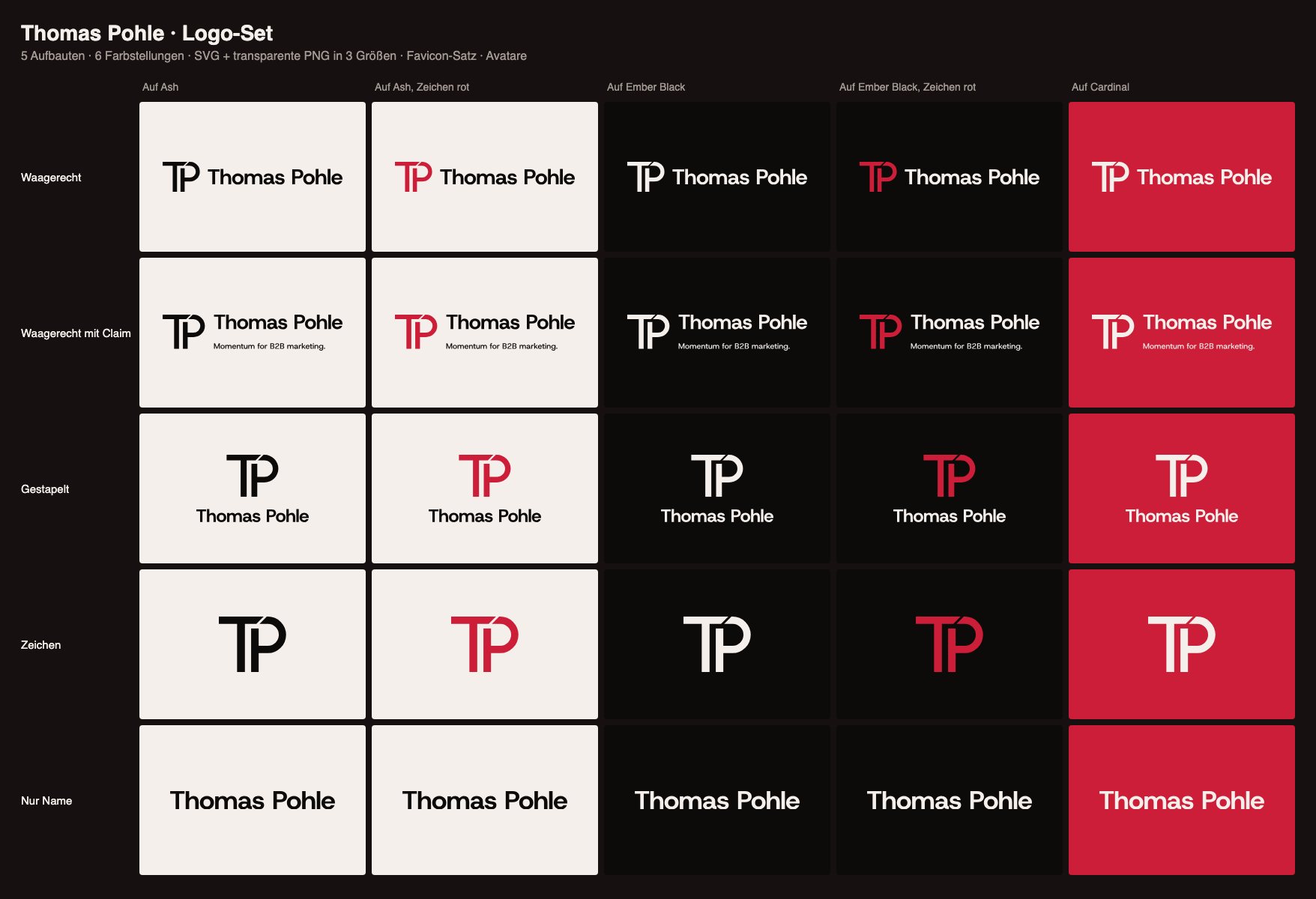
Which lockup, which size
| Lockup | File | Use | Minimum |
|---|---|---|---|
| Horizontal (main) | horizontal | Website header, slides, signature, documents | 120 px wide, 30 mm print |
| Horizontal + claim | horizontal-claim | Letterhead, offers, stage, banners | 240 px wide, 60 mm print |
| Stacked | stacked | Square and portrait formats, merch | 80 px wide, 20 mm print |
| Mark TP | icon | Favicon, avatar, slide corner, watermark | 16 px, 6 mm print |
| Name only | wordmark | Where the mark already appears nearby | 100 px wide |
Color versions
| Suffix | Ground | Description |
|---|---|---|
red-ash | dark | Cardinal mark, Ash name. Default on dark. |
red-black | light | Cardinal mark, Ember Black name. Default on light. |
red | dark | Mark only, Cardinal. |
ash, black | dark, light | One color, when red is already used on the surface. |
pure-white, pure-black | any | Print, embossing, stamps, partner lists. |
Files
Every lockup as outlined SVG (no font needed) and as transparent PNG in three widths. Machine-readable index with sizes: /logos/index.json.











































































































Clear space
Keep free space around the logo equal to the width of the T stem (14% of the mark height) on every side. Nothing enters this zone: no text, no edges, no other logos.
Favicon and avatars
favicon.svg, favicon.ico (16, 32, 48), favicon-16.png, favicon-32.png, favicon-48.png, apple-touch-icon.png (180), icon-192.png, icon-512.png. Ash mark on Ember Black. Profile avatars: dark with red mark, dark, red (SVG, PNG 1000 in the same folder).



What not to do
- Redraw, retype or stretch the mark
- Recolor the mark outside the defined versions, for example violet or yellow
- Put Ember Black on Cardinal for text or the name (3.6 : 1, too weak for small type)
- Add shadows, outlines, gradients or 3D
- Place the logo on busy photos without a calm dark area
- Rotate or tilt it, even for dynamics
03 Color
Dark is the stage. One red, no second. The same Cardinal is used for the mark, accent words, buttons and the light trail, on dark and on light ground. More than 90% of every surface is Ember Black, Ash and Cardinal.
Ember Black#0D0A0A · ground
Ash#F4EFEA · text on dark, print ground
Cardinal#CC1E38 · the one red
Neutrals
Smoke#A39A94 · secondary text on dark
Stone#6E6560 · secondary text on light
Surface#161010 · cards on dark
Surface 2#1D1414 · raised card, hover
Line#2A1D1C · borders on dark
Contrast, recalculated (WCAG 2.1)
| Text and ground | Ratio | Allowed for |
|---|---|---|
| Ash on Ember Black | 17.3 : 1 | Everything |
| Smoke on Ember Black | 7.1 : 1 | Everything |
| Cardinal on Ash | 4.8 : 1 | Everything |
| Ash on Cardinal | 4.8 : 1 | Everything, including button labels |
| Stone on Ash | 5.0 : 1 | Secondary text on light |
| Cardinal on Ember Black | 3.6 : 1 | Large only: text from 24 px (19 px bold), logo mark, buttons, light trail |
| Ember Black on Cardinal | 3.6 : 1 | Never for text. Contrast is symmetric, but dark type on red reads as a warning and fails for small sizes |
Rules
- One red, everywhere the same. No tints, no second red.
- One red moment per screen. One accent word, one button or the trail.
- On dark, small text is never red. Text below 24 px uses Ash or Smoke.
- On Cardinal, everything is Ash.
- No violet, no yellow. Violet belongs to TEISENDA, yellow to Emma Woelk.
Backup color: Petrol
Not a brand color. Default answer: don’t use it. Petrol #1E4F4C on light, Petrol Light #5FB8AE on dark. Only for a second data series that grey cannot carry, or a status that must not look like the brand (for example a form error next to the red button), and only after Cardinal plus grey has been tried. Never in the logo, on buttons, in headlines or as a surface. Under 3% of any surface.
04 Typography
One typeface for everything: Host Grotesk. It is not one of the fonts AI tools reach for by default, and it matches the geometric cut of the TP mark. Emphasis comes from color, never from a second typeface. Let’s get it moving.
| Role | Weight | Use |
|---|---|---|
| Headlines, numbers, names | 700, 600 | Display, H1 to H3, the name in the logo |
| Body, UI, captions | 400, 500 | Running text, buttons, tables |
| Accent word | same weight as the headline | One word or short phrase per headline in Cardinal. No underline, never italic or serif |
Web scale
| Style | Desktop size, line height | Tracking | Mobile |
|---|---|---|---|
| Display | 64 / 1.03 | −0.025em | 40 |
| H1 | 58 / 1.03 | −0.025em | 36 |
| H2 | 52 / 1.03 | −0.025em | 32 |
| H3 | 26 / 1.15 | −0.015em | 22 |
| Body | 18 / 1.55 | 0 | 17 |
| Small | 14 / 1.5 | 0 | 14 |
Hard limits on every page: H1 at most 64 px on desktop and 44 px on mobile, no H2 larger than the H1.
Rules
- Host Grotesk only. No second family, no serif accents, no italic accent words.
- No eyebrows, no kicker lines, no badges above a headline.
- No ALL CAPS, except abbreviations like B2B or CEO.
- The accent word carries the meaning. It is the word that moves: momentum, moving, found.
- Never these fonts: Inter, Roboto, Arial or Helvetica as main face, Open Sans, Lato, Montserrat, Poppins, Geist, Space Grotesk, DM Sans, Plus Jakarta Sans, Manrope, Outfit, Sora, Satoshi, Clash Display, General Sans, Cabinet Grotesk, Syne, Instrument Sans, Instrument Serif, Playfair Display, Bricolage Grotesque, Bodoni Moda.
Font files
Free under the SIL Open Font License. Self-hosted only: HostGrotesk-VF.woff2 (web), HostGrotesk-VF.ttf (desktop apps), license. Fallback: a metric-matched Arial (“HG Fallback” in tokens.css), so text breaks the same before the web font arrives.
05 Names
| Name | Write | Never |
|---|---|---|
| Brand | Thomas Pohle | “TP” in running text, “Pohle Advisory” as sender |
| Claim | Momentum for B2B marketing. | translated, reworded, without the full stop |
| Role line | B2B Marketing Advisor · CEO & Co-Founder, TEISENDA | “Marketing AI Expert”, “Growth Hacker”, “Guru” |
| Legal entity | Pohle Advisory GmbH | outside imprint, invoices, contracts, signature footer |
| Company | TEISENDA, always in capitals | “Teisenda” |
Formats: Momentum plus format
Momentum Workshop
One day. Positioning, ideal customer and the one channel that moves first.
Momentum Project
Four to twelve weeks. One campaign, one channel or one launch, set up and run with the team.
Momentum Advisory
Monthly. Sparring for the CEO, hands on the team when it counts. Marketing leadership without the hire.
Others, markets, numbers
- Write other companies the way they write themselves: Link11, Beekeeper, smino. Name clients only with their written approval.
- Eight markets: Germany, Switzerland, Austria, United Kingdom, France, Sweden, Poland, USA.
- Numbers are never invented. Format: CHF 40,000 · 10+ years · 30%. Results stay placeholders until confirmed.
- US English throughout: optimize, color, program. The German website version uses standard German with ß and the Sie form.
06 Imagery
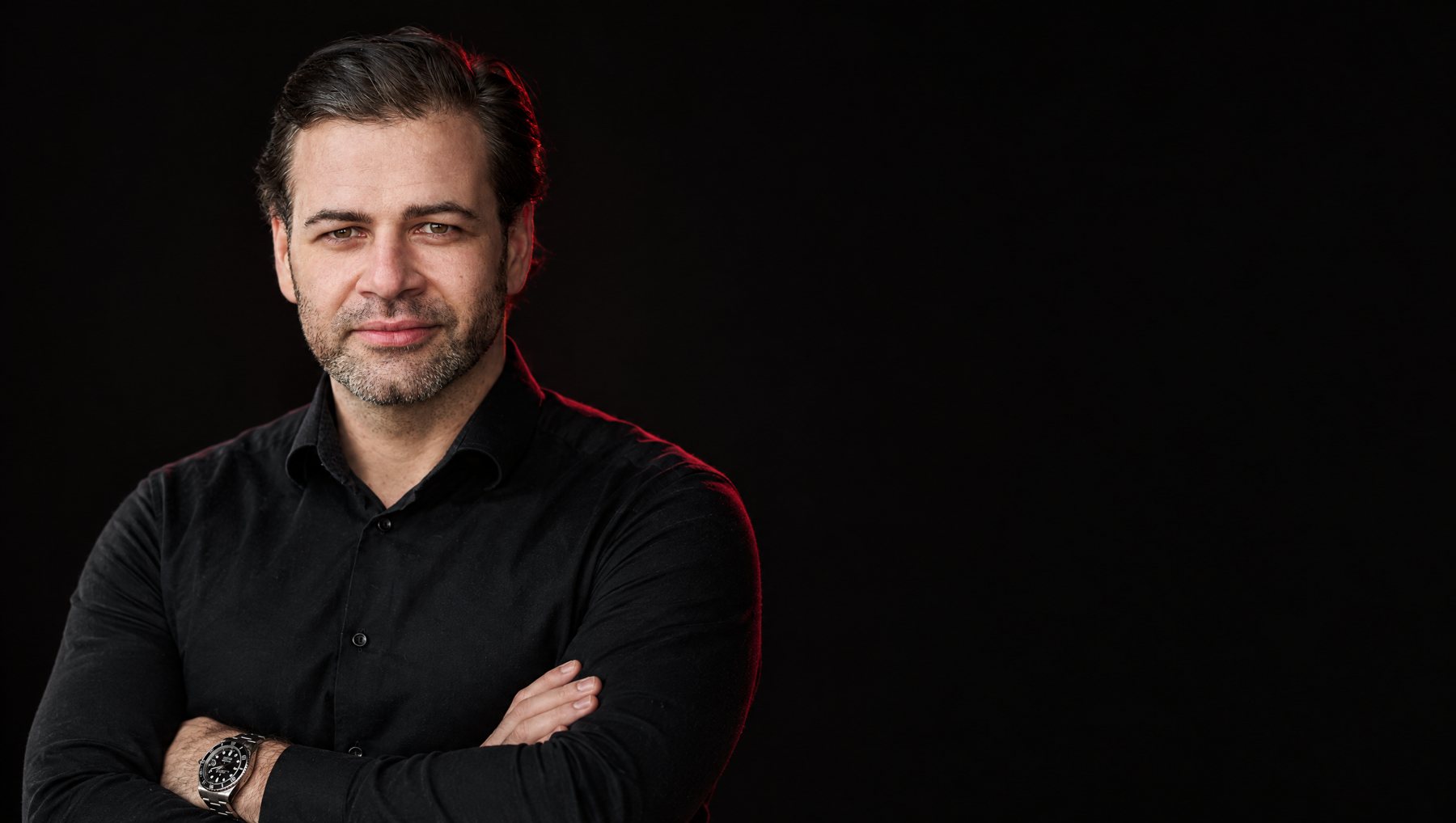
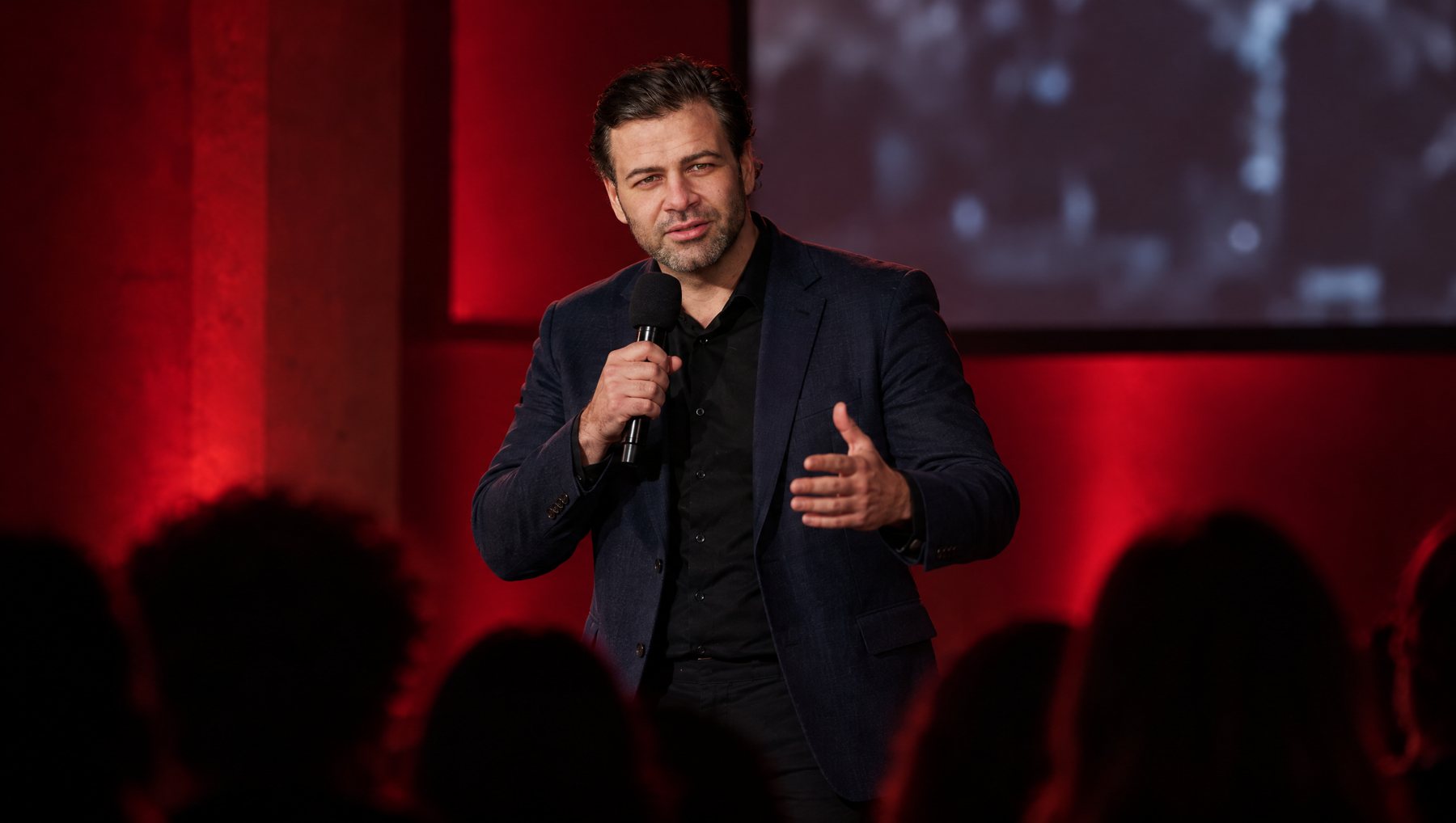
One person, one light. Thomas in low-key light with a single Cardinal edge. Everything else stays dark.

Two gears
| Gear | Talk | Pitch |
|---|---|---|
| Where | LinkedIn, stories | Website, slides, speaker profile, offers |
| Look | Real and imperfect: phone photos, screens, behind the scenes | Ember look: low-key, Cardinal rim light |
The Ember look
- Near-black ground, soft key light front left, one thin Cardinal rim light from behind right.
- Black shirt is the signature. Dark navy blazer on stage.
- Calm, confident, half smile. Never posing like a guru.
- Never violet or blue light, never yellow accents, no white studio backgrounds, no stock handshakes.
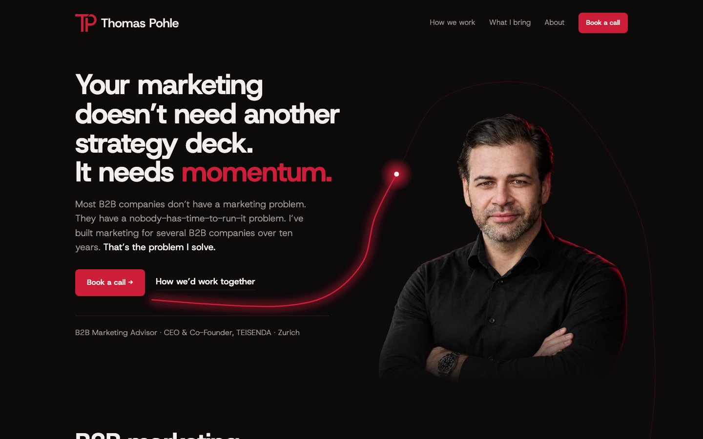
- On the website the hero portrait is always a cut-out without frame, head and upper body.
AI images
Allowed, including Thomas. Workflow: exactly two reference photos (Shooting Stettin 2025, DT 0167 and DT 0173), GPT Image 2.5 Flare, quality high. Never mix several photos of the same person into one image.
Photorealistic photo of exactly this man from the two reference photos, same face, hair, beard and age, natural skin texture. Near-black background, soft key light from the front left, thin deep crimson rim light (#CC1E38) from behind right. Black shirt. No violet or blue light, no text, no logos.- Never present an AI image as a real event, client or place.
- Never generate clients or other real people.
- No fake stages with event names, no fake logos on screens.
- Check face fidelity and hands before use.
Icons
Phosphor, Regular for content, Bold for small sizes. Always inline SVG, never a CDN stylesheet. Ash on dark, Ember Black on light, never red, no duotone, never Lucide. No icon on top of cards. List: /icons/index.json.
07 The light trail
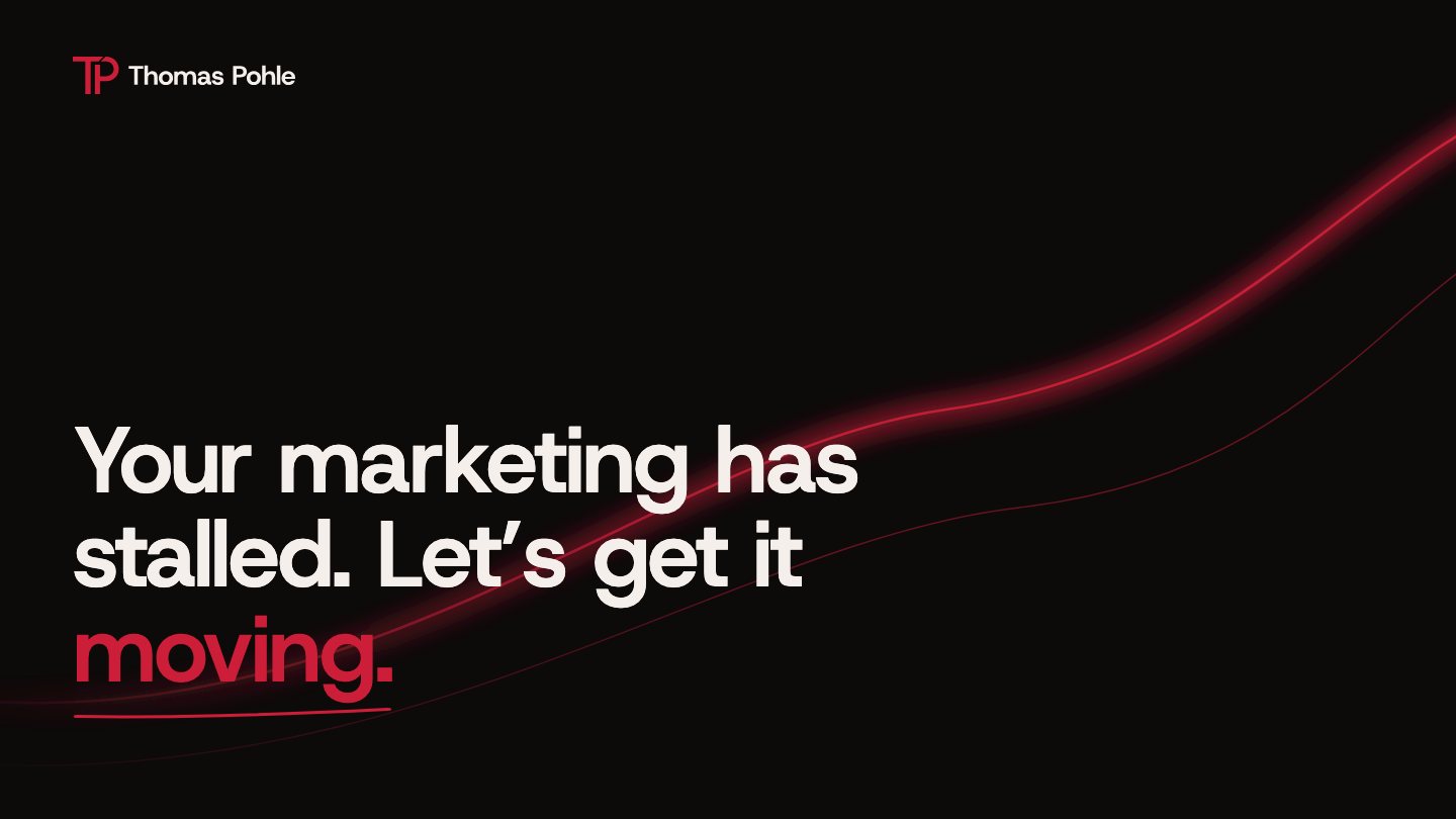
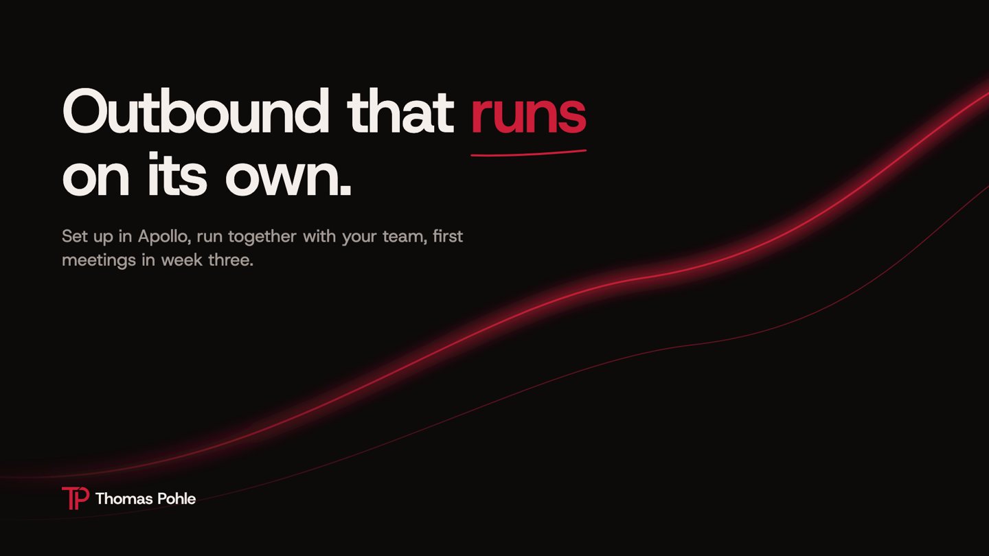
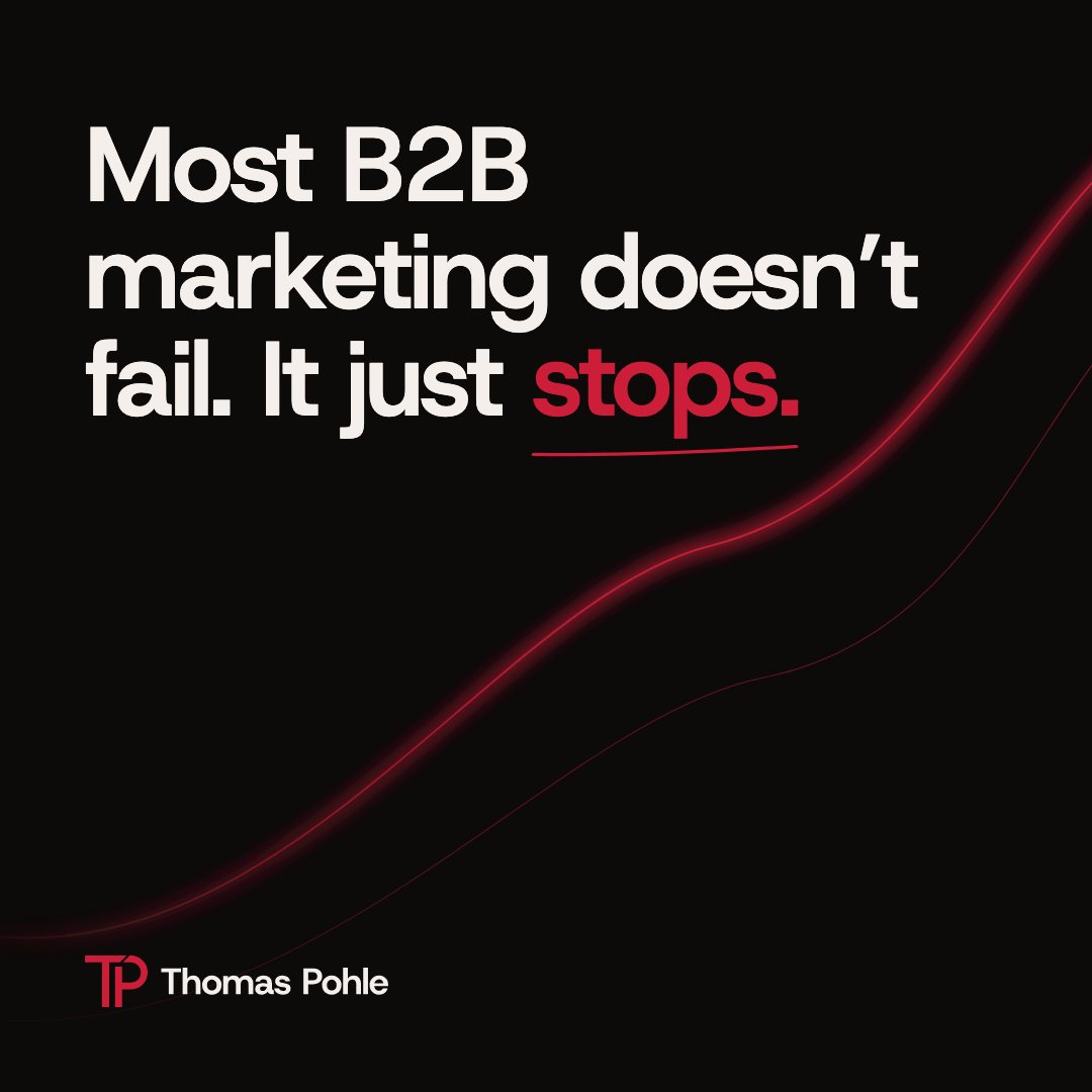
Momentum as an image: one Cardinal trail that rises from left to right and ends at the next step. On this page it runs as an accompanying line along the right margin, and its head marks where you are reading.
Three levels
| Level | Where | How |
|---|---|---|
| Full | Hero, final CTA, title and chapter slides, social tiles | 2 to 3 px line plus soft glow |
| Accompanying | Long pages, between sections, content slides | 1 to 2 px line, little or no glow |
| Detail | Dividers, signature, documents, under a number | A short piece of the curve |
Rules
- One trail per surface. Never two trails at once.
- Rising and smooth. Left to right on heroes and slides, no spikes, no hooks, no loops. Curves are splines with a radius of at least 40 px.
- Never through text and never across a divider line. It runs in free space behind content.
- It ends at the next step: the CTA, the next slide, the next carousel card.
- On the web it draws with the scroll. With reduced motion it is shown complete.
- Carousels: the trail continues exactly where it left the previous card.
- Only Cardinal, only on dark ground. On light ground only as a detail line.
08 Voice
Thomas writes like a smart founder talking to another smart person. Not like a content marketer writing for a CEO.
| Gear | Talk | Pitch |
|---|---|---|
| Where | LinkedIn, podcast, stage, comments | Website, offers, proposals, outreach |
| Goal | Reach, credibility, conversation | A booked call |
| Sound | Spoken, rough edges, stories, dry humor | Tight, clear benefit, one next step |
| Never | A sales pitch | Corporate |
Fast, bold, smart in writing
- Fast: to the point in the first line. Short paragraphs. Fragments are fine.
- Bold: clear opinions. Opinion stays opinion, fact stays fact.
- Smart: authority from experience, never self-praise.
- First person I, reader you, contractions, real numbers and names.
Never
- Emojis
- Em dashes
- Hashtags
- Links inside a LinkedIn post (first comment instead)
- Invented or unverified numbers
- “5 lessons I learned”, fake vulnerability, “As a founder…” openers
Words
| Use | Avoid |
|---|---|
| momentum, moving, get going | 10x, rocket |
| pipeline, meetings, revenue | synergy, revolutionize |
| set up, run, ship, together, next step | “In today’s fast-paced world” |
| leverage, unlock, seamless, game-changer, empower: in a pitch only, never in a headline | journey, ecosystem |
| growth hacking only as a topic or SEO keyword | “I do growth hacking” |
Before and after
Before
We offer holistic marketing solutions for companies in today’s fast-paced world.
Pitch
Your marketing doesn’t need another strategy deck. It needs momentum.
Talk
Most B2B companies don’t have a marketing problem. They have a nobody-has-time-to-run-it problem.
09 In use
Templates for the places the brand shows up most. Copy the structure, keep the rules.
Website header and hero
E-mail signature
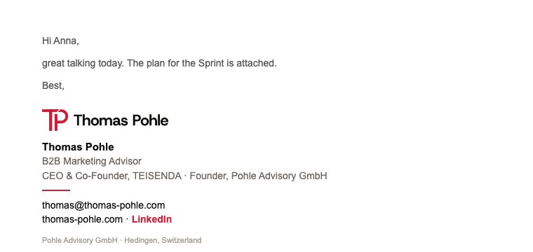
<table cellpadding="0" cellspacing="0" border="0" style="font-family:Arial,Helvetica,sans-serif;color:#0D0A0A;font-size:14px;line-height:1.45">
<tr><td style="padding:0 0 12px 0"><img src="https://ci.thomas-pohle.com/logos/png/thomas-pohle-horizontal-red-black-600.png" width="180" alt="Thomas Pohle" style="display:block;width:180px;height:auto;border:0"></td></tr>
<tr><td style="padding:0"><span style="font-weight:bold;font-size:15px">Thomas Pohle</span><br>
<span style="color:#6E6560">B2B Marketing Advisor</span><br>
<span style="color:#6E6560">CEO & Co-Founder, TEISENDA · Founder, Pohle Advisory GmbH</span></td></tr>
<tr><td style="padding:10px 0 0 0"><hr style="border:0;border-top:2px solid #CC1E38;width:40px;margin:0 0 10px 0;text-align:left">
<a href="mailto:thomas@thomas-pohle.com" style="color:#0D0A0A;text-decoration:none">thomas@thomas-pohle.com</a><br>
<a href="https://thomas-pohle.com" style="color:#0D0A0A;text-decoration:none">thomas-pohle.com</a> · <a href="https://www.linkedin.com/in/thomas-pohle" style="color:#CC1E38;text-decoration:none;font-weight:bold">LinkedIn</a></td></tr>
<tr><td style="padding:12px 0 0 0;font-size:11px;color:#6E6560">Pohle Advisory GmbH · Hedingen, Switzerland</td></tr></table>Slides

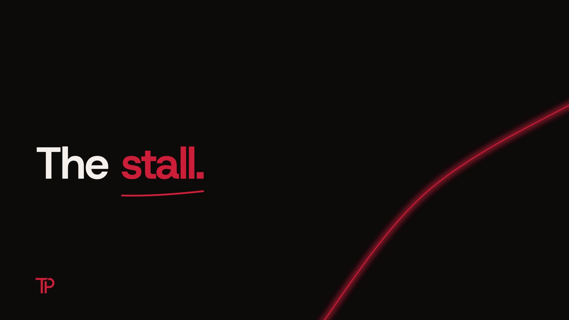
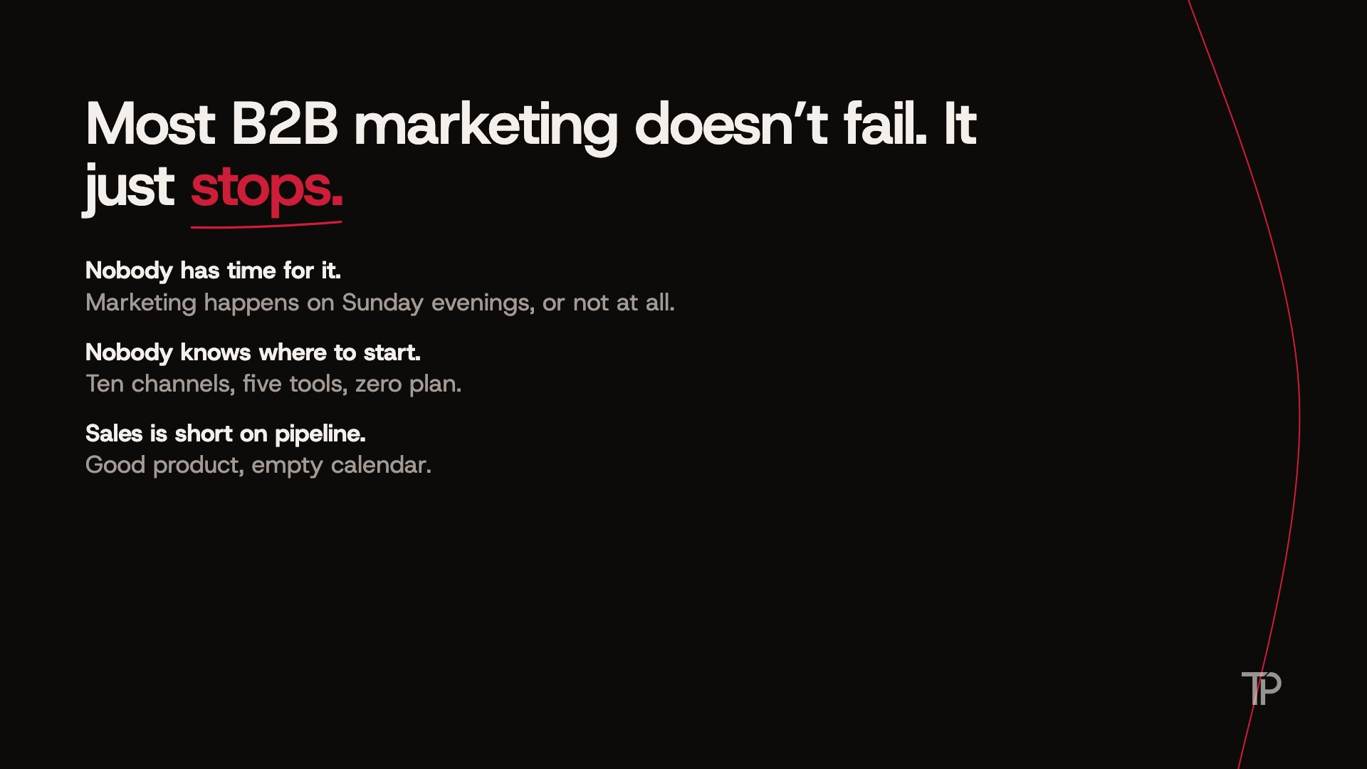
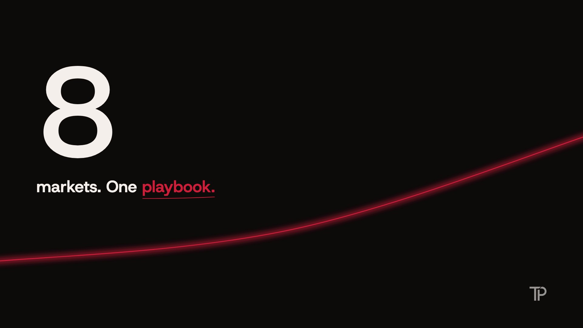
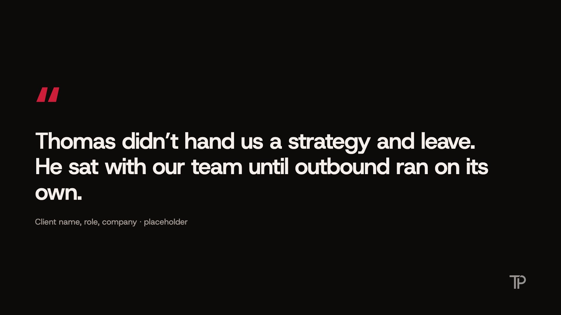

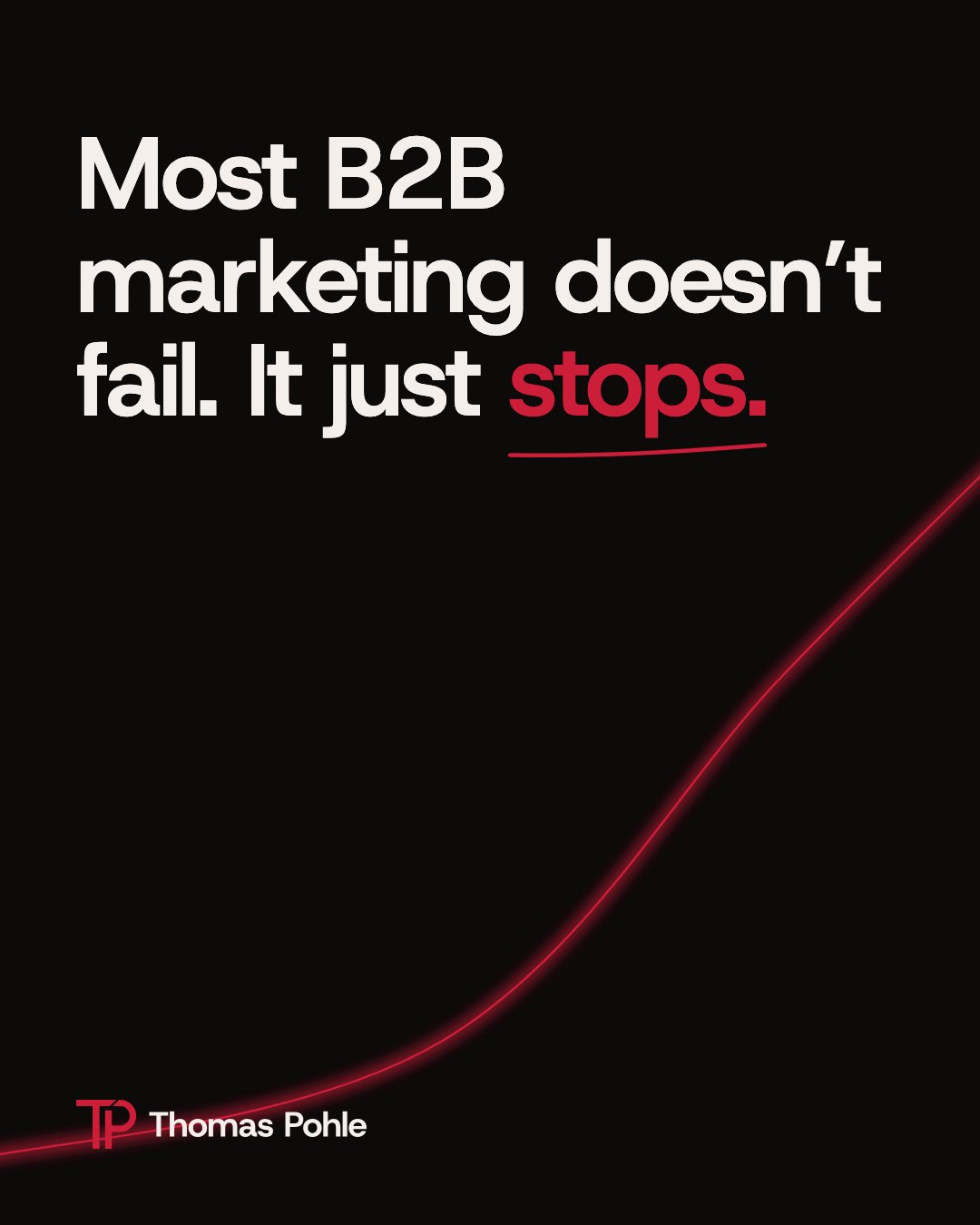
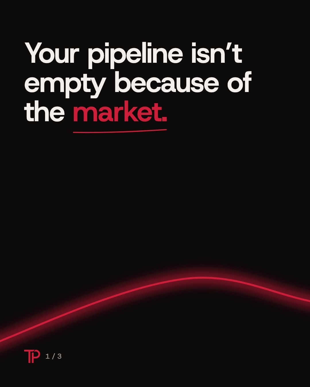
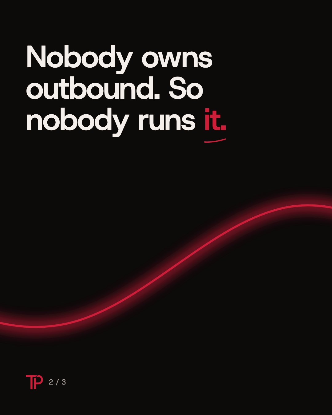
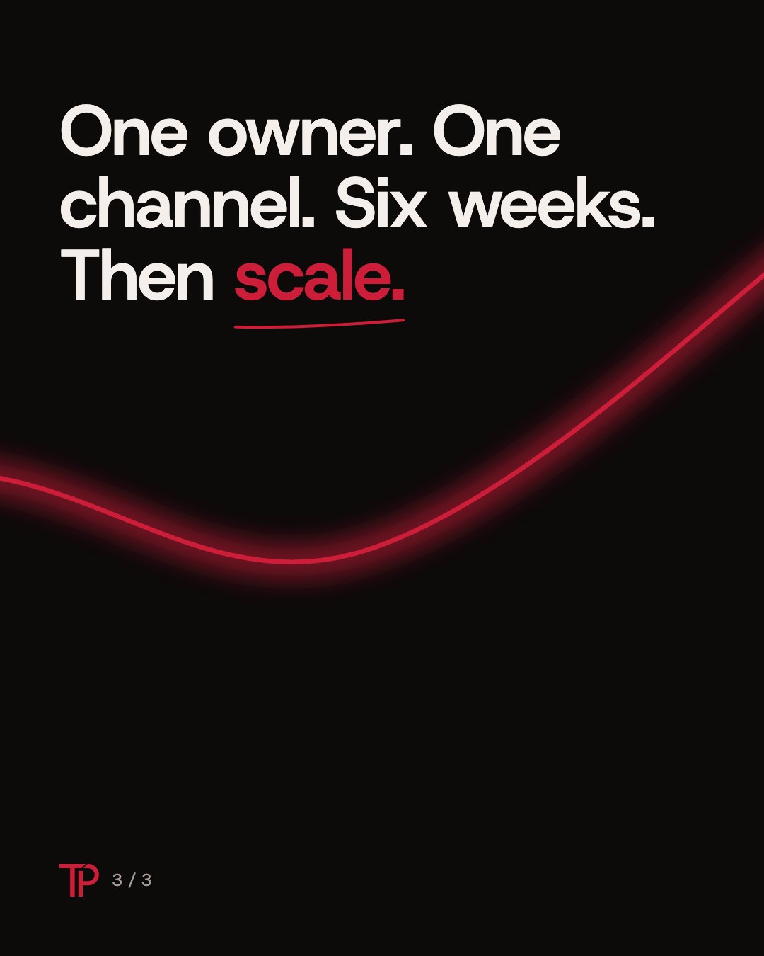
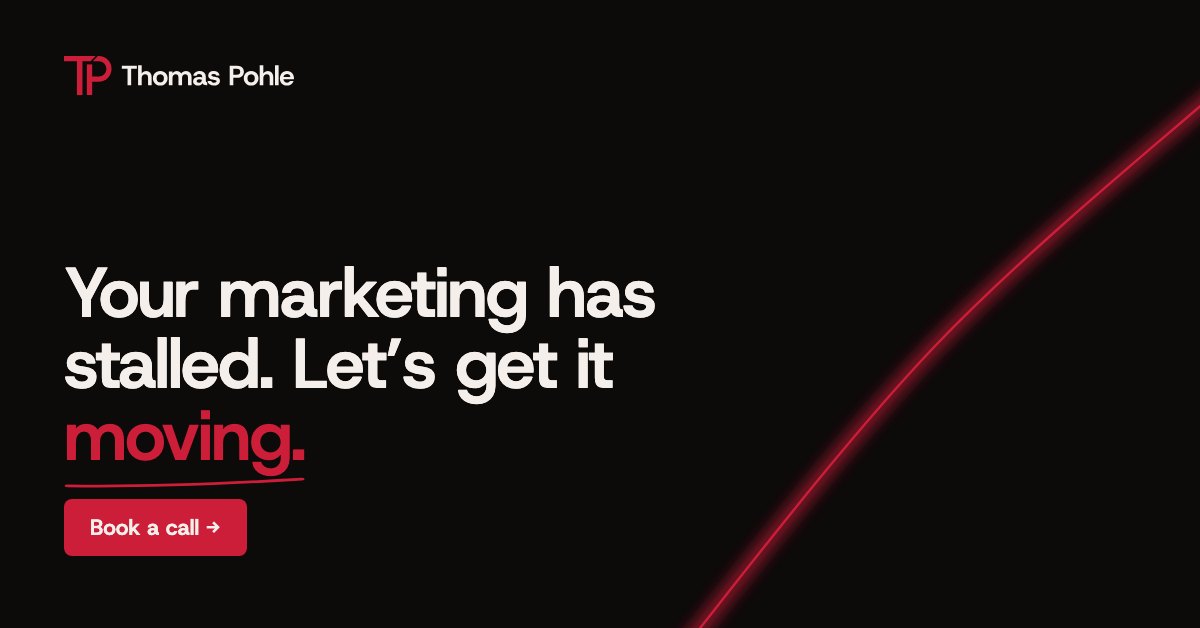
Ad and key visual
Document on paper
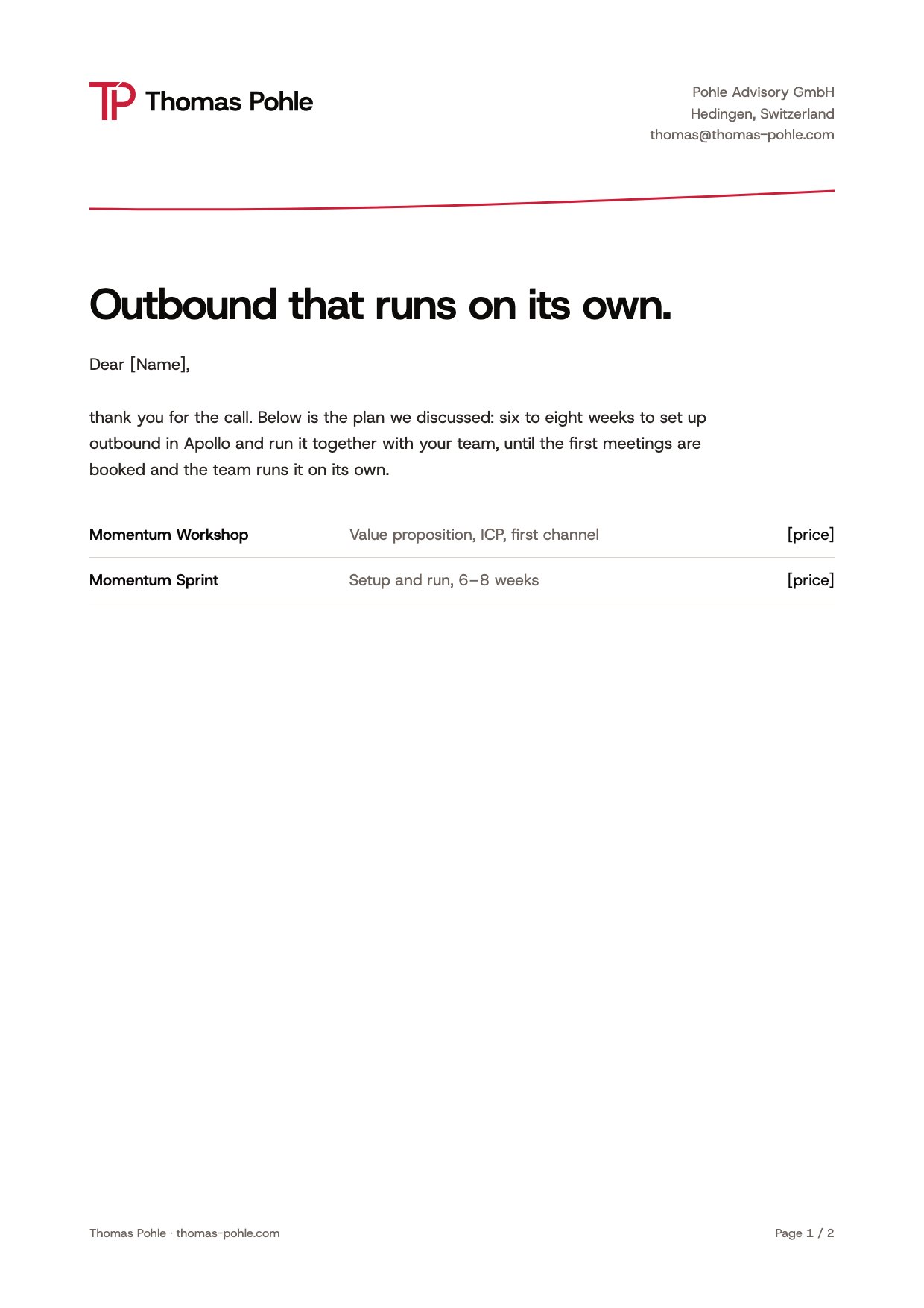
- Print and long documents are light: white or Ash ground.
- Headings Host Grotesk 700, body 400.
- Footer: Thomas Pohle · thomas-pohle.com, page number. Imprint data on invoices only.
- Invoices and contracts name Pohle Advisory GmbH as sender.
Before you publish
- Is there exactly one red moment on this screen or page?
- Is red only used large on dark ground?
- At most one accent word per headline? No eyebrow, no badge above the H1?
- Does the trail rise smoothly, avoid text and dividers and end at the next step?
- Is the logo an original file, in the right version for the ground, with clear space?
- No violet, no yellow, no Lucide icons, no banned fonts, only Host Grotesk?
- Does it pass the anti-AI check (chapter 10) and the QA script?
- Every number real and sourced? No emojis, em dashes or hashtags?
- Does it sound like Thomas: fast, bold, smart, never a guru?
10 Components and effects
Few parts, used the same way every time, and nothing that looks like a template.
Buttons
Primary: Cardinal, Ash label, 8 px corners (never a pill), one per screen. Secondary: outline with a Line border or a plain text link. Hover: lift by 1 px and a soft ring. Both demo buttons link to the live website.
Lists instead of cards
Content is grouped with space, lines and type, not with boxes. Cards are only used for things you can click. No icon on top of every item, no colored edges, no cards inside cards.
Never looks AI-made
Every page is checked against the anti-AI rulebook and the QA script before it goes live. The short version:
Type
Host Grotesk only. No eyebrows, no ALL CAPS, no serif italic accent, none of the AI default fonts.
Color
No purple, no gradients, no neon, no colored glows. The glow on the light trail is the one named exception.
Layout
No badge above the H1, no centered hero, no identical icon cards, no stat banners, no 1-2-3 circles, no glassmorphism.
Copy and code
No “unlock your potential”, no three-word slogans, no em dashes, no invented numbers. Always OpenGraph tags and real alt texts.
The final question before publishing: would anyone think at first glance that an AI made this? If yes, it is not finished.
Motion
| What | How |
|---|---|
| Hover, focus | 0.2 s, ease cubic-bezier(.2,.7,.2,1) |
| Light trail | Draws with the scroll; its head marks the reading position |
| Accent word | Letters fly in from the right and brake into place, the same way everywhere |
| Content | Stands from the first frame. No fade-up on every section |
| Reduced motion | Everything shown complete, no movement |
11 Handover
Everything a developer, designer or AI tool needs, in files.
| File | Content |
|---|---|
| llms.txt | All rules as plain text for AI tools |
| tokens.css | Self-hosted font, metric fallback, CSS variables, accent word and button classes |
| tokens.json | Colors, contrast, type scale, radius, icon rules, banned list |
| logos/index.json | Every logo file with lockup, color, ground and pixel size |
| icons/index.json | Icon set, weights, core icons and rules |
| fonts/ | Host Grotesk variable font (WOFF2, TTF) and license |
Tokens
@font-face{font-family:"Host Grotesk";src:url("/fonts/HostGrotesk-VF.woff2") format("woff2");font-weight:300 800;font-display:swap}
:root{
  --tp-ember-black:#0D0A0A; --tp-ash:#F4EFEA; --tp-cardinal:#CC1E38;
  --tp-smoke:#A39A94; --tp-stone:#6E6560; --tp-surface:#161010; --tp-surface-2:#1D1414; --tp-line:#2A1D1C;
  --tp-font:"Host Grotesk","HG Fallback",sans-serif;
  --tp-display:clamp(40px,4.4vw,64px); --tp-h1:clamp(36px,4.2vw,58px); --tp-h2:clamp(32px,4.2vw,52px); --tp-h3:clamp(22px,2.2vw,26px);
  --tp-radius-card:6px; --tp-radius-button:8px; --tp-ease:cubic-bezier(.2,.7,.2,1);
}
/* full file with the metric-matched fallback font: tokens.css */Embed the font
<link rel="preload" href="/fonts/HostGrotesk-VF.woff2" as="font" type="font/woff2" crossorigin>
<link rel="stylesheet" href="/tokens.css">
<!-- self-hosted only: copy /fonts/ next to your page. Never load Host Grotesk from Google Fonts or another CDN. -->Button
<a class="tp-button" href="https://thomas-pohle.com/#contact">Book a call →</a>
<a class="tp-button tp-button--ghost" href="https://thomas-pohle.com/#how">See how I work</a>
<!-- needs tokens.css -->Scrollbar
html{scrollbar-color:#2A1D1C #0D0A0A}
::-webkit-scrollbar{width:10px}
::-webkit-scrollbar-track{background:#0D0A0A}
::-webkit-scrollbar-thumb{background:#2A1D1C;border-radius:10px}
::-webkit-scrollbar-thumb:hover{background:#CC1E38}